The space I intend to use for the mock-up of my electronic story board is the side of a bookcase just inside the door to my study as shown below.
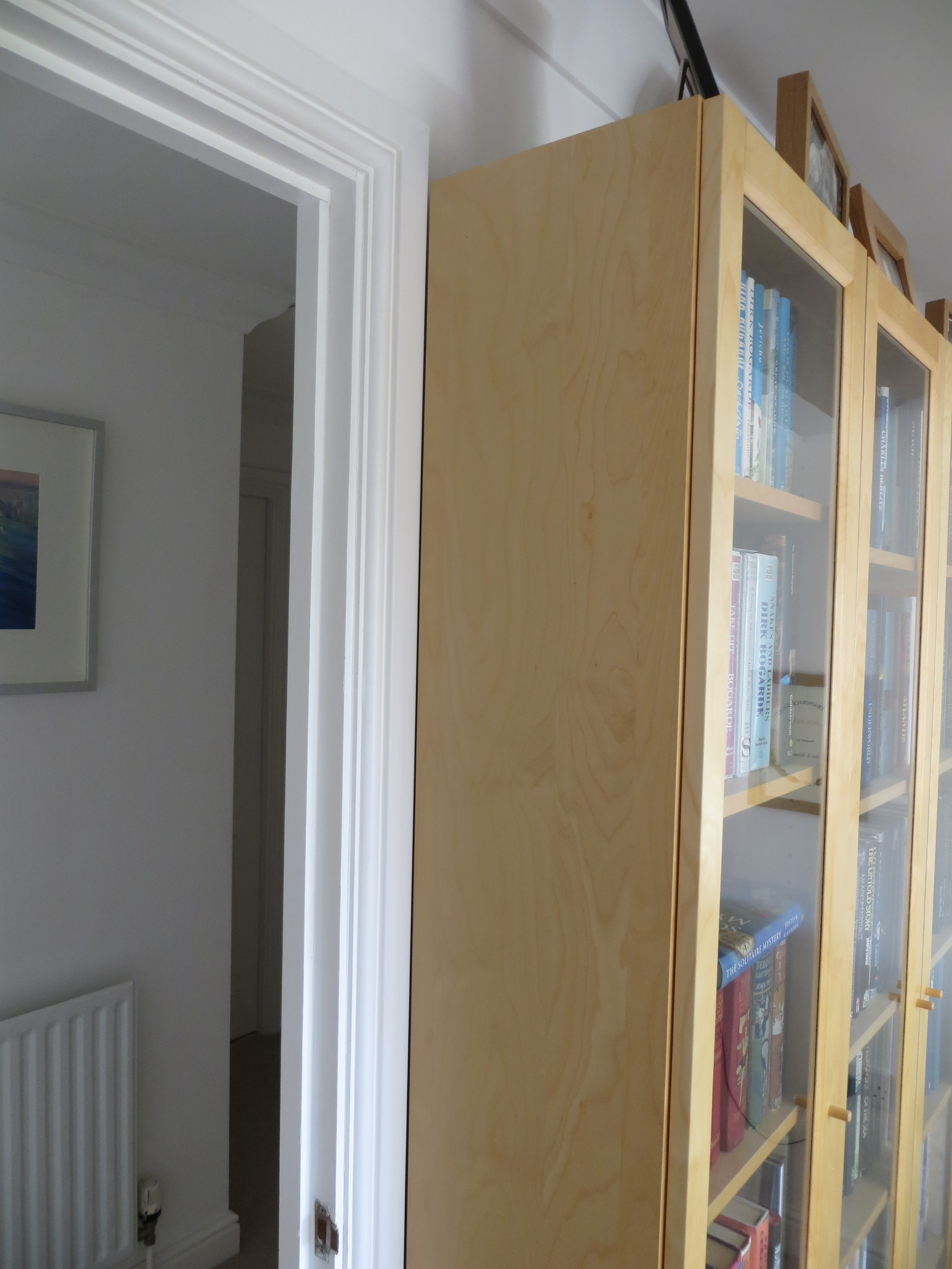 I figure that, in that position, I’ll be encountering it every day and be encouraged to use it. The side of the bookcase measures about 28 x 200 cm so the design of the Story Board has to fit into that space. Having considered a variety of options, I’ve decided to go with three main components, each of them sitting one below the other: a) a display of the spines of the books next to each other as though they were sitting on a shelf, with a unique number above each spine, b) an area which will display a numbered A4 laminated card containing the story for a particular book in portrait orientation, and c) an open box container for all the A4 laminated cards in number order. The decision to go for a portrait A4 design means that I’ll be able to create each story in Powerpoint and print it out on my printer without any difficulty. My current thoughts about securing all this to the bookshelf are to construct it on two thin wooden struts which would have a hook structure at the top so that it would just hang from the top of the bookshelf – however this will need some further thought and experimentation.
In the meantime, I’ve been working on a template for the A4 story card and have come up with a design which has three concentric vertical ellipses.
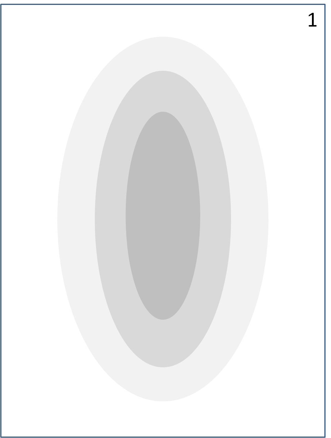 The spine of the book concerned and a thumbnail of its cover, will go in the central ellipse; and the story elements which are strongly related to the book will overlap the other ellipses. Story elements less strongly related will be placed outside the ellipses on the edge of the story board. To see how well this works in practice I tried it out on the first book – Levinson’s ‘Pragmatics’ – see below.
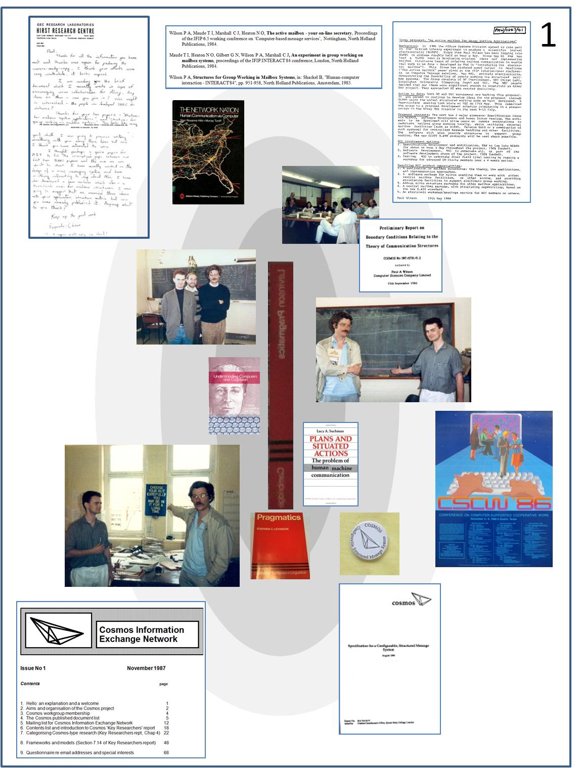 The key points that emerged from this exercise were:
- Several of the items are text which needs to be readable to be useful, but which is unreadable when reduced to a size which can be fitted onto the story board.
- The images are easy to recognise even when much reduced in size.
- The largest ellipse is coloured so lightly that its presence is easy to miss.
The final point should be easy to sort out – I’ll just experiment with the ellipse fills. However, the first point about the text is a serious issue. I think there’s only two ways round it – either to make all the text big enough to read, or else use a thumbnail for the document with a callout box containing a portion of the text which is big enough to read.