Turning a Stamp Album into a Book

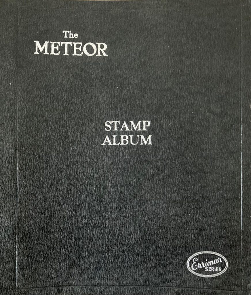
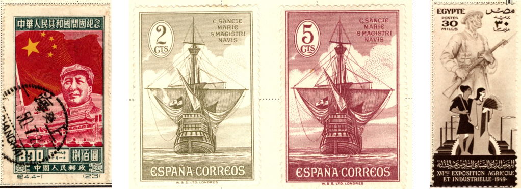
It was in the lounge of our house in Singapore in the 1950s that my father took me through some of the pages of his album. I was about 7 or 8, and it’s my earliest recollection of stamps. Some big ones made particular impressions –  two portraying Spanish Galleons, one of a long grey one of a man, and a red one with a star.


A few years later I started collecting stamps myself. I wasn’t an avid collector, but the various accoutrements of my collection – albums (stick-in and stock books), tweezers, country envelopes, tatty envelopes full of stamps on paper waiting to be soaked off – had always been with me from those early days. It was something I did from time to time – a tactile and gentle pursuit – as had hundreds of thousands of like-minded collectors for well over a hundred years.

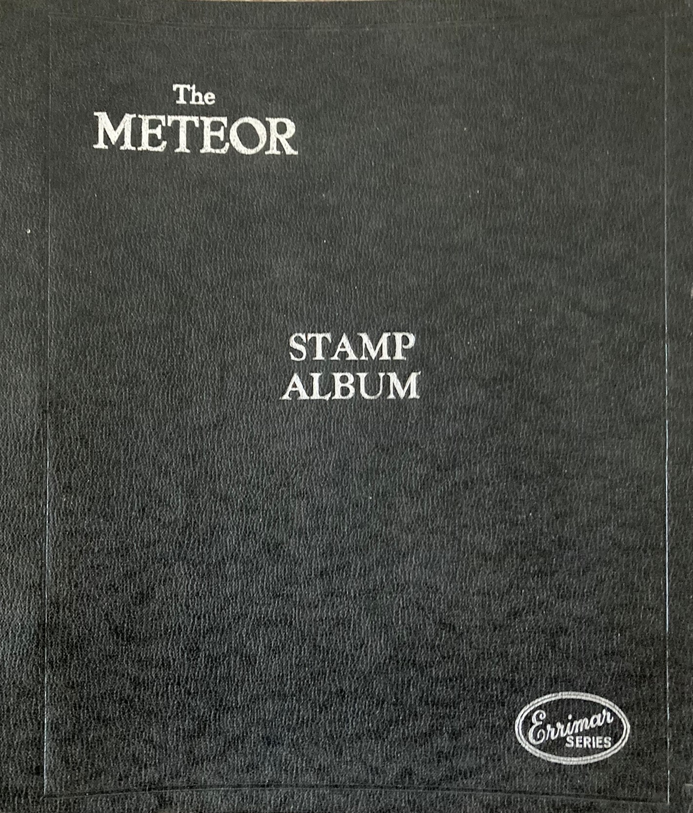
Sometime in the 1990s, when my father was getting on a bit, he gave me his stamp albums – including that one he had showed me in the lounge in Singapore all those years ago. I didn’t do much with that Meteor album for several years; but, as retirement approached in 2012, a germ of an idea started to formulate. The album wasn’t full by any means but it did contain a substantial number of stamps across about 30 countries. My father had always produced beautiful handwriting, and he had written the name of the relevant country in black ink and capital letters at the top of each page as in the example below.

I decided I would discard pages without a country name and would try and completely fill all the pages that remained in the album, unconstrained by date order, or whole or part sets, or whether they were mint or used; but guided by the eras of the existing stamps. I made one exception to this goal: Italy was particularly well endowed with stamps, so I decided to use the spare untitled pages to collect all Italian stamps produced up to 1980 as defined in the 1997 Stanley Gibbons Simplified Catalogue. I perhaps didn’t quite realise at the time how ambitious this might be, though, in my defence, I may have casually thought that it wouldn’t matter if some of the more expensive items were simply missed out (a seriously unrealistic misjudgement….). Anyway, once full, the album would then become a kind of memorial of my father and his stamp collecting and his immaculate writing. I could round it off with a page at the beginning describing how he collected stamps and inspired me to do so, and including some photos of him at various stages of his life.

I duly gathered together the pages with country headings, moved stamps on untitled pages, and set about finding stamps to fill the gaps. Having this goal inspired me to attend stamp fairs, and to start buying auction lots; and by about 2017 I’d completed 14 of the 33 countries; but I was starting to realise that it was going to be a big – and expensive – job to acquire the whole of Italy up to 1980.

It was also in 2017 that my second grandchild was born and I was beginning to wonder whether I, like my father, would be able to pass on my stamp collection to one or both of them. I knew that none of my own children were in the slightest bit interested in stamps; so, the grandchildren were probably the last port of call. However, there could be no guarantee that they would be interested either; and, in any case, what would happen if they both became collectors? How could I choose which one to give their great-grandfather’s album to? I ruminated on this conundrum as I continued to add to the album.

Sometime during the following few years, I decided to augment the burgeoning album with the catalogue entries for the stamps it contained (something I’d already done successfully in my Great Britain album by simply cutting out the relevant parts of pages from the ‘Collect British Stamps’ catalogue). I reasoned that the information associated with the issuance of stamps – whether to commemorate a person or event, or to indicate what reign of a monarch it took place in – was not only useful to manage the collection, but also interesting, perhaps even educational, even for those not generally interested in stamp collecting; and that the relative values of different stamps attest to the scarcity and desirability of the more valuable items. All this information would surely make the album that much more interesting to its potential future owners. To enable the reader to match a stamp to its catalogue entry would simply require that the relevant catalogue number was written next to each stamp.

I started with the Italian collection and placed cut-outs or photocopies of the relevant catalogue entries onto the relevant pages.

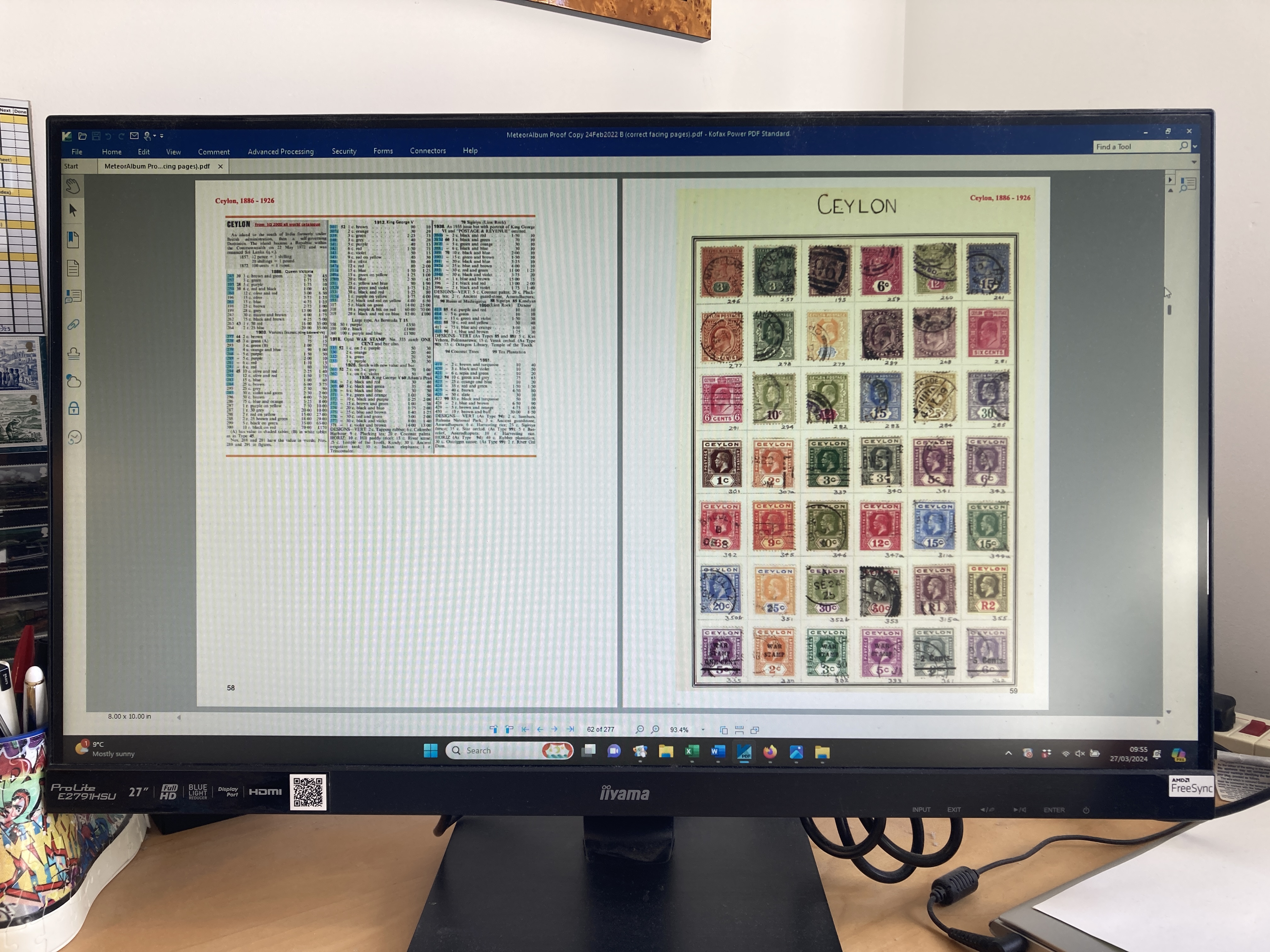
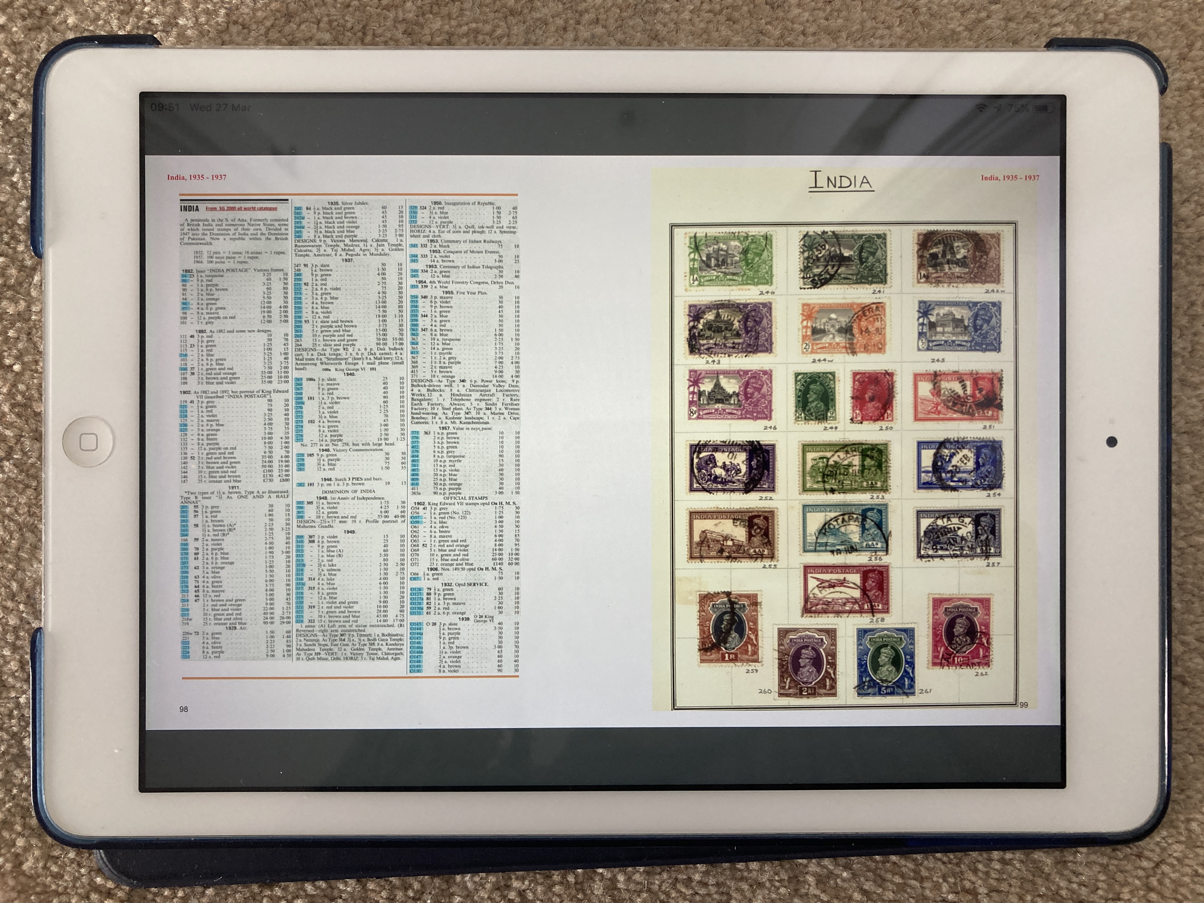
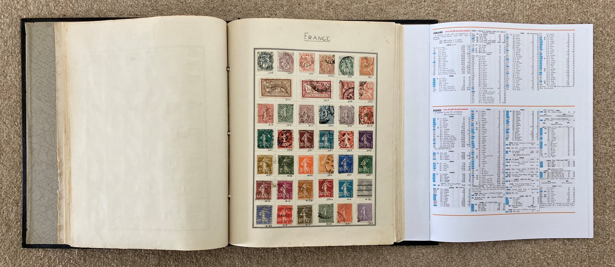
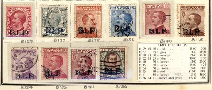
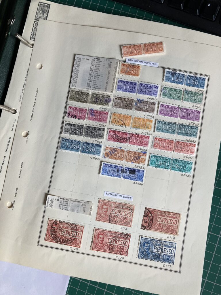
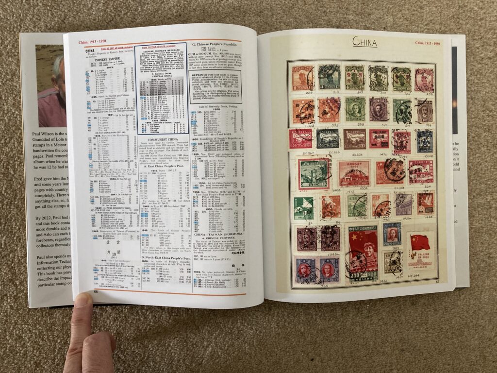
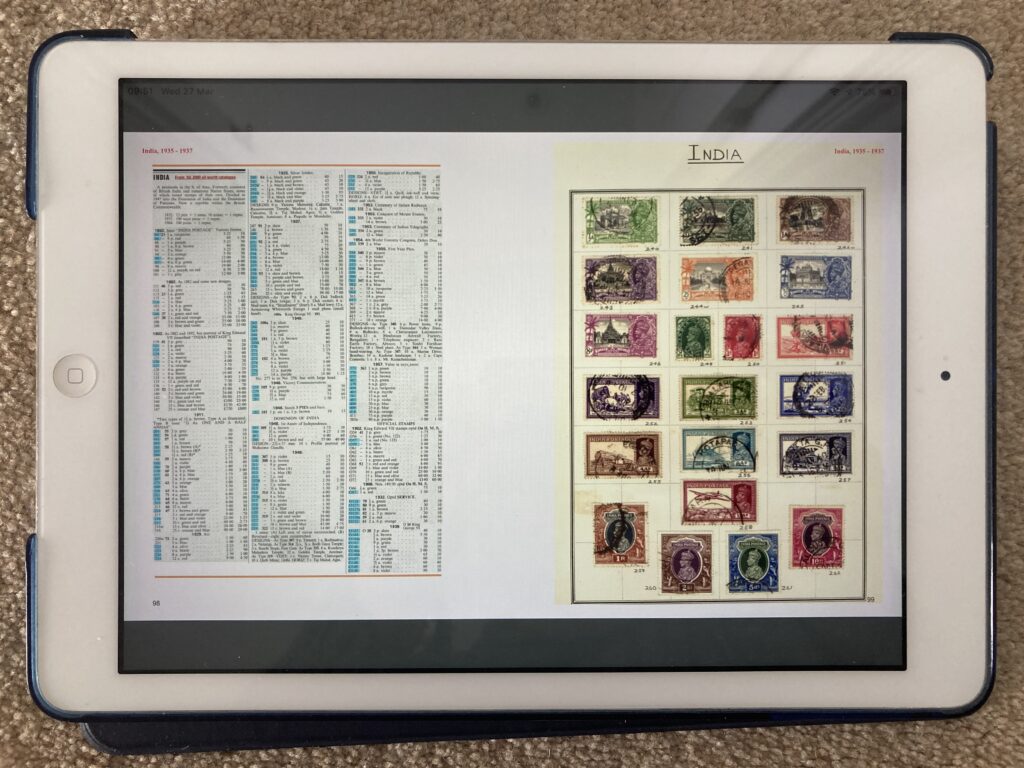
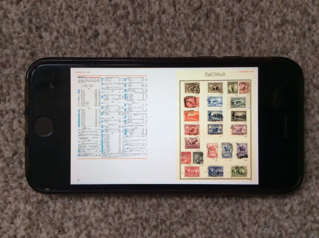
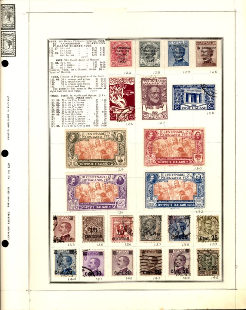
When it came to the other countries, though, I realised this wouldn’t work because, not being constrained to stamps from consecutive dates or sets, meant that there was just too extensive a range of catalogue entries to include. So, for those pages, I elected to scan the relevant catalogue pages and to cut and paste the entries relevant to a particular album page onto a single page using the PowerPoint software package (the blue highlights in the example below indicate which stamps are included in the album).

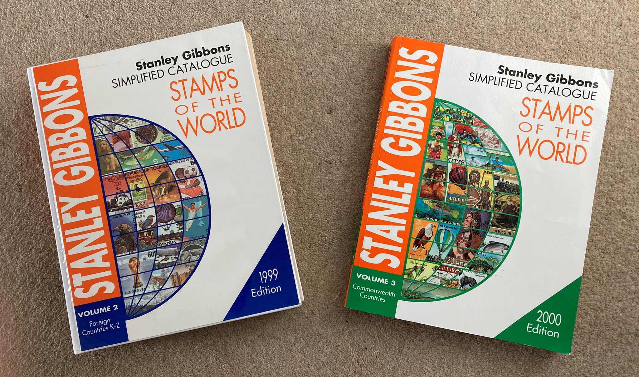
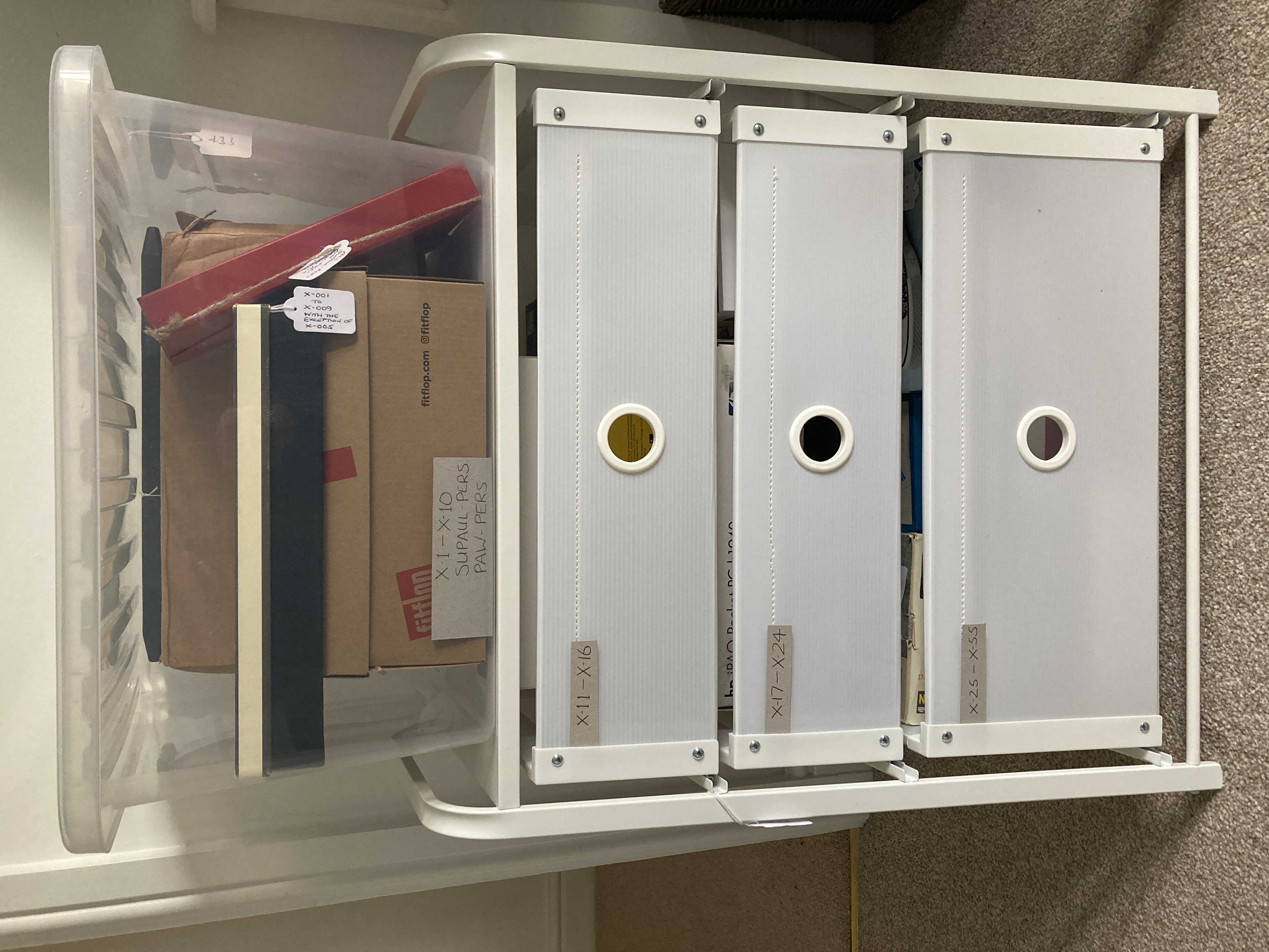
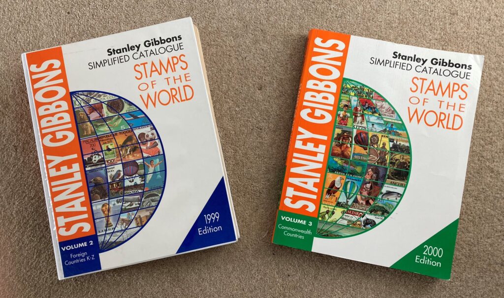
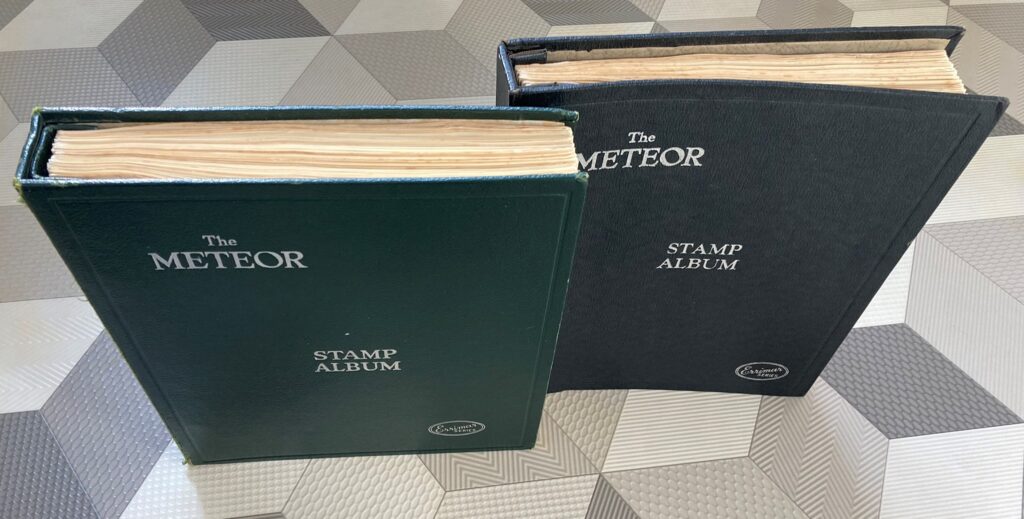
My plan was to print these pages out and to attach them to the inside back cover of the album so that the relevant page could be turned out to the right of the album and be visible when a particular album page was being looked at. I was confident that I could achieve this at the bookbinding classes I’d been attending for 5 years or so. I duly acquired two old 1999 and 2000 Simplified Catalogues for the non-Italian countries for about a fiver each on ebay (shown below) and set about assembling the catalogue entries for each country and labelling each stamp in the album.

In 2020, I had won an auction lot of a single album dedicated to Italian stamps including many of the more valuable earlier items. This made substantial inroads into my Italian Wants list.  It had cost me £380 – about double the amount I usually invested in an auction lot; but, after removing the stamps I needed, I was able to break up the contents and sell them for around £200 overall – an excellent defrayment of the original cost.

2020 was also the year I decided I would self-publish a book about my IT experiences over the previous 50 years, using an internet-based company called Blurb. The resulting 8×10 inch hardback with 440 glossy pages, lots of colour photos and images, and a glossy, full colour, wrap-around dust jacket initiated another germ of an idea. I realised that I could scan the pages of the filled Meteor album and include them in a Blurb-produced book. I could have two copies of the book produced, so that I could give one to each grandchild at some point. It wouldn’t matter if they marked or tore them, or damaged them in any way, as the digital version would always be available to produce new copies if necessary. There would be no concerns about damaging or losing valuable stamps, or of the album being sold off by young adults eager to release funds (a possibility perceived by my own youthful short-sightedness); and I could have a copy myself, secure in the knowledge that, if my collection was stolen at any time, or destroyed in a fire or random act of god, I would still have the book to look at and enjoy.

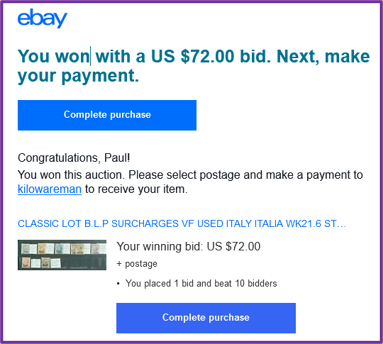
With these ideas firmed up and cemented in my mind, I set out with renewed vigour to complete the non-Italian countries, and to start acquiring the more expensive Italian stamps (by that point I’d decided it had to be ALL the Italian stamps to 1980). Ebay was my main source for this material, though I did get some stamps from eBid and Hipstamp. Using all these sites, I soon completed all but two of the non-Italian countries, and started to home in on the remaining Italian wants. It soon became apparent to me that the more expensive stamps could be purchased for a wide range of prices. This was partly due to varying quality but was also related to how quickly individuals or dealers wanted to realise their cash. I started to scour eBay regularly looking for bargain ‘Buy-it-Nows’ or low starting prices. I eventually came across Kilowareman – an unusual operation based in the Netherlands which appeared to have an unlimited supply of ex-dealer’s stock and which published dozens of new lots on ebay every day with a standard starting price of 1 Euro regardless of value, including many of the Italian stamps I wanted. I bought several of the high value stamps I needed from Kilowareman, and was never disappointed; despite a standard £1.50 postage cost to anywhere in Europe, they always arrived safely about a week after the auction in a cellophane packet attached to a page inscribed ‘greetings from Kilowareman’ inside a simple envelope. On one extraordinary occasion I won a lot of 7 overprinted stamps with a catalogue value of several thousand pounds (at 2020 values) with a bid of £54 which I submitted in the last few seconds of the auction while having a post-competition lunch at a golf club.

Common sense would say that they must be fakes – but they didn’t look any different from the real thing and I wasn’t going to start detailed investigations to determine if they were genuine or not. They would look fine in my father’s album; and, in any case, I reasoned that, if KIlowareman was selling bulk lots of ex-dealer’s stocks, then the original dealers would have had to be taken in as well or simply not have marked the items as of doubtful provenance – which was possible but perhaps a little unlikely. Well, that was my rationale for happily paying far less than catalogue value for the more expensive stamps.

By early 2022, I was very close to completing the whole collection with just 3 Italian stamps to get. One of the Italian stamps was specified as a 10 cent stamp in the Stanley Gibbons Simplified album, however, all my trawlings and investigations led me to believe it was a 40 cent stamp (which I did have). So, I emailed the Stanley Gibbons Catalogue Department and asked if this was the case. On 19th January I received the answer – it was indeed a long-standing misprint – reminding me that you can never be absolutely sure that anything in print or on the internet is correct: reader beware!

On the same day I bought one of the other two outstanding items in HipStamp, leaving me with a last remaining gap for PL650, a 30 cent blue Italian Parcel Post stamp from 1945. Not the most expensive Italian stamp according to Stanley Gibbons (£39 mint, £31 used), but the most elusive in my experience.  I finally found it a week later by searching an Italian Dealer’s items on eBay using the Italian word for parcel – ‘pacchi’. I’d missed this previously because, for some unknown reason, searches using the English equivalent, ‘parcel’, didn’t produce any hits – despite the word parcel being displayed in the title of the lot – ‘1945 Lieutenancy Parcel Post 30 Cent MNH’. However, all became clear when I got confirmation of my order from ebay: The actual title was, ‘1945 LUOGOTENENZA PACCHI POSTALI 60 CENT MNH’, and the title I’d been shown must have been an automatic translation which was not used in the search algorithm. It was a timely reminder that internet searching is not an exact science, and that some thought and perseverance may be required to find what you want.

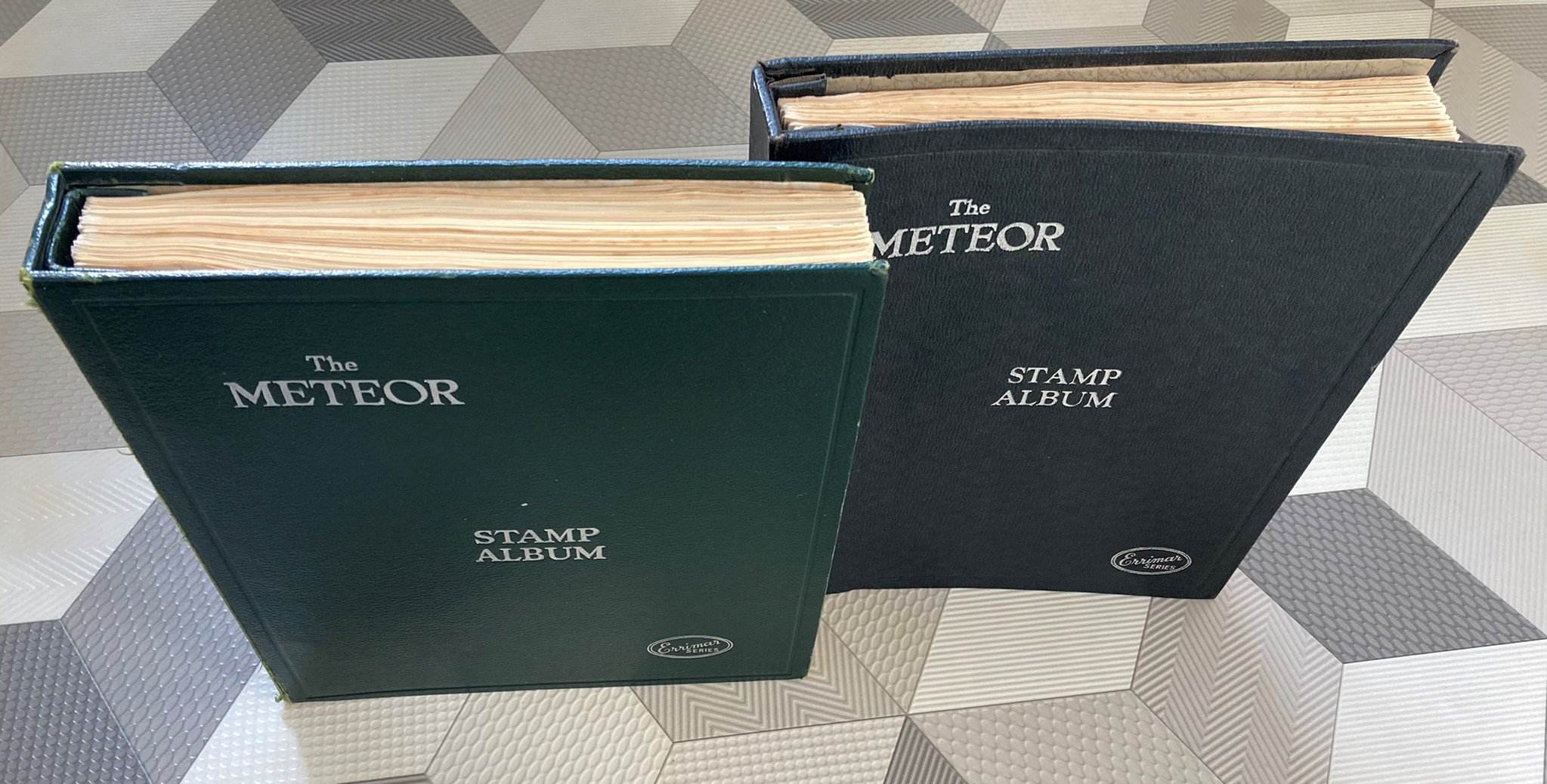
By this time, I had started to explore how I would construct the book using Blurb’s BookWright software. I decided that there were too many stamps to include in a single album, so I bought another album just like the one my father had given me, on eBay. I then had one album for the Italian stamps and one for all the other countries.

Next, I turned to the practicalities of assembling the album pages in Blurb’s publishing programme – particularly the following:

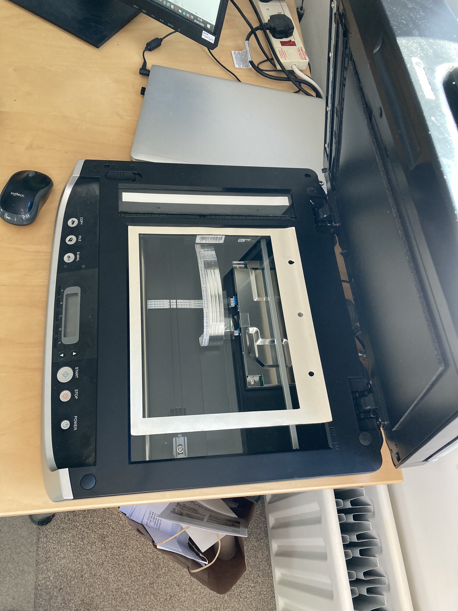
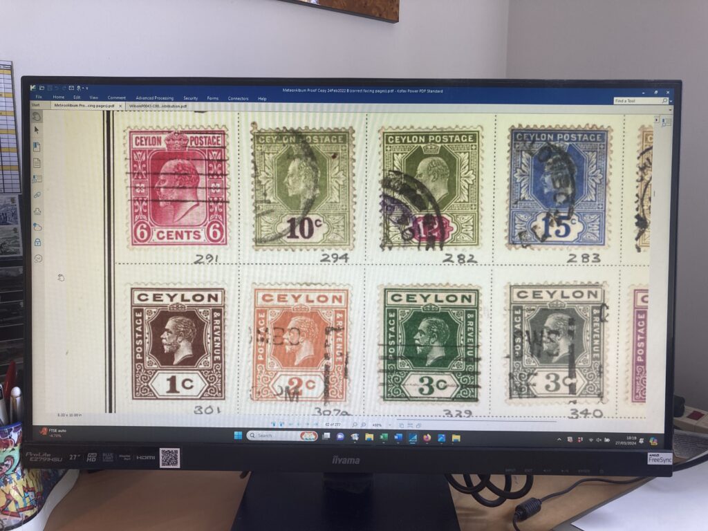
  • Ensuring the stamps would be reproduced in actual size: The scan of a whole album page was too big for the book page, so when importing the scan to a Blurb page the system automatically resized it to fit thereby producing smaller than actual sizes of the stamps. To avoid this, I needed to crop the image before importing it; so, I created an overlay which lay on the scanner platen and on which the album page was layed. 
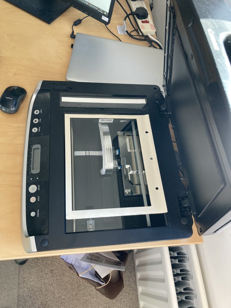
The outline of the overlay in the resulting scan was where the image would be cropped. Using this approach, and after some trial and error, I got the sizes of the stamps in the imported images in the book to be pretty much actual size.
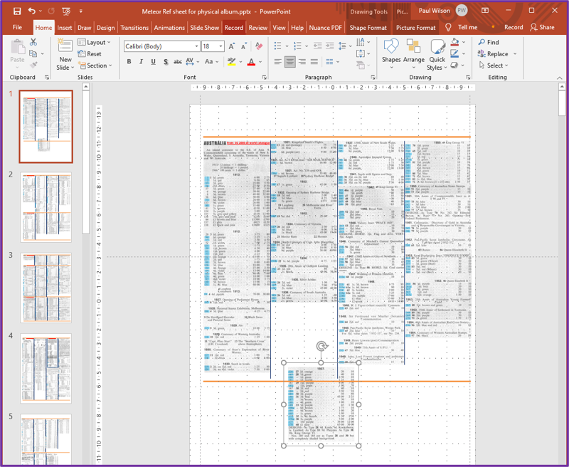
  • Getting the composite catalogue pages in shape: The four-column format I’d used to construct the composite catalogue pages for each country was based on them fitting into the back of the meteor album. However, as I’d already discovered with the album pages, the Blurb book pages were smaller, and I realised I would have to rejig the country catalogue pages to a three-column format. This wasn’t too difficult using Powerpoint, and I exported the resulting images in png format ready for inclusion in the book. There was one issue – Blurb alerts warned me that the resolution of these images were ‘lower than that which Blurb recommends for great print quality’. This despite me scanning the catalogue pages at a very high resolution. I think resolution deteriorated through the various stages of cutting and pasting elements of the overall page.  Anyway, they were readable when I printed them out from PowerPoint, so I hoped they’d still be readable in the Blurb book, and indeed it turned out that they were.
  • Positions, sizes and colours of page numbers and running headers: I decided to provide a standard header on each page consisting of country name and date range of the stamps on the page, for example, ‘Ceylon, 1886 – 1926’. These would be placed in bold red 10 pt Times New Roman font at the top of each page, on the left side of the left-hand pages and on the right side of the right-hand pages. For page numbers, I used the standard Blurb function to place them in similar positions to the headers but at the bottom of the page, using bold black 10 pt Arial font. I realised that some of the page numbers might be obscured by the black surround of some album pages – but decided I would deal with that once I’d got everything in place.

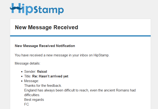
With all these preparations complete, I started assembling the contents of the book on the 1st February. It took roughly 100 hours over a 17-day period to scan all 169 album pages, check all the catalogue images against each scanned album page, and to insert both album page scan and relevant catalogue image into the BookWright application. Conveniently, the last stamp I was waiting for to complete the album arrived on the penultimate day of scanning after a 30-day journey from Italy. I had been waiting for it for three weeks before messaging the vendor, Fisicol (an Italian dealer using the Hipstamp site), asking when I could expect it, and he advised that it often took three or four weeks; and sure enough it arrived a week later. Shortly after setting the status to ‘Received’ and providing feedback, I received the following memorable message from Fisical:

I duly placed this, the last of the two thousand and forty seven Italian stamps, with some sense of achievement, into the Concessional Parcel Post section of the Italian collection, replacing the single left-hand version for which I had been unable to obtain a right-hand partner. The whole collection totalled 4084 stamps dated between 1860 and 1980, from 33 countries.

After some final tidying and checking of the whole volume in Bookwright, I sent the book for printing at a cost of £81 a copy. I now have three copies of a beautiful, glossy, 274-page, book containing an introduction and both albums – one for myself and one set aside for each for my two grandchildren which I shall give them when they are a little bit older.

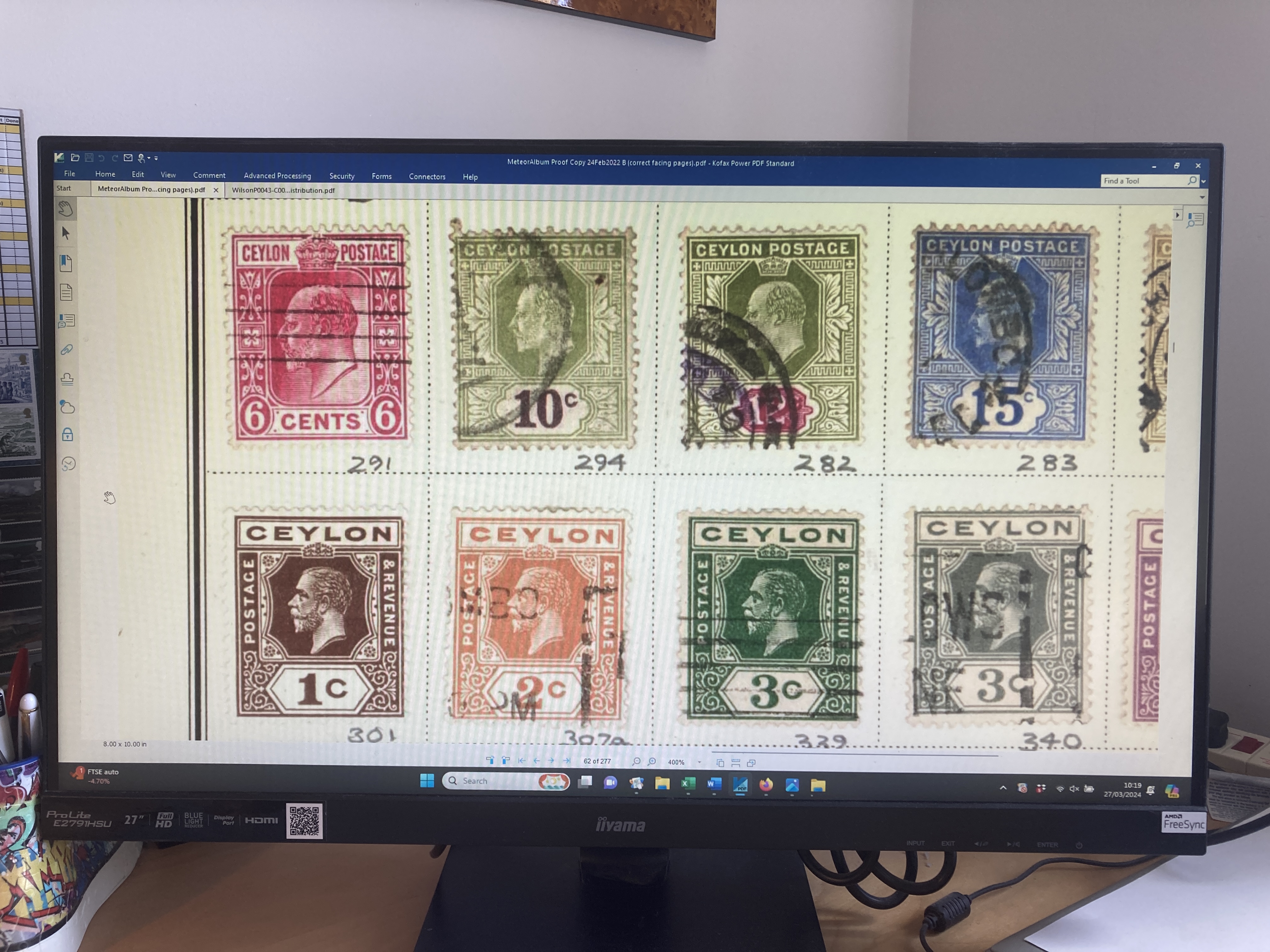
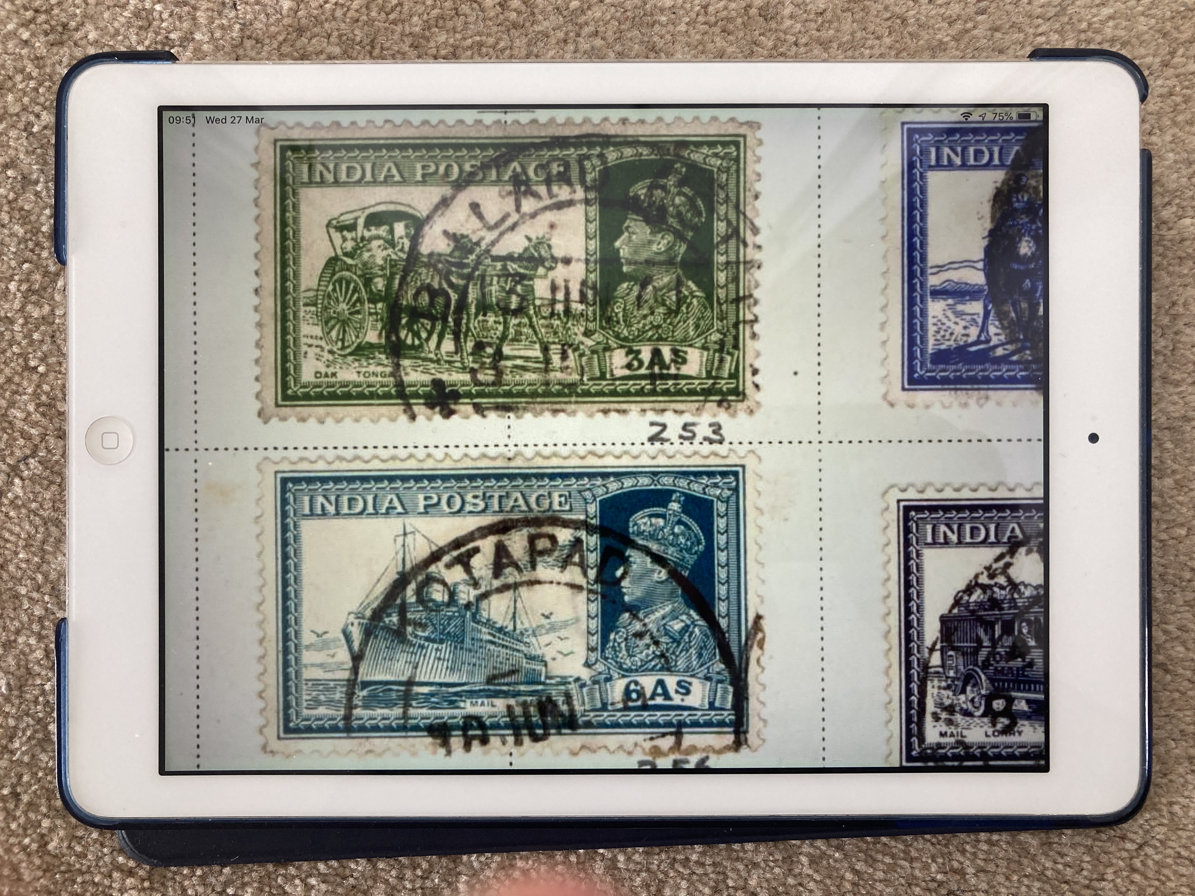
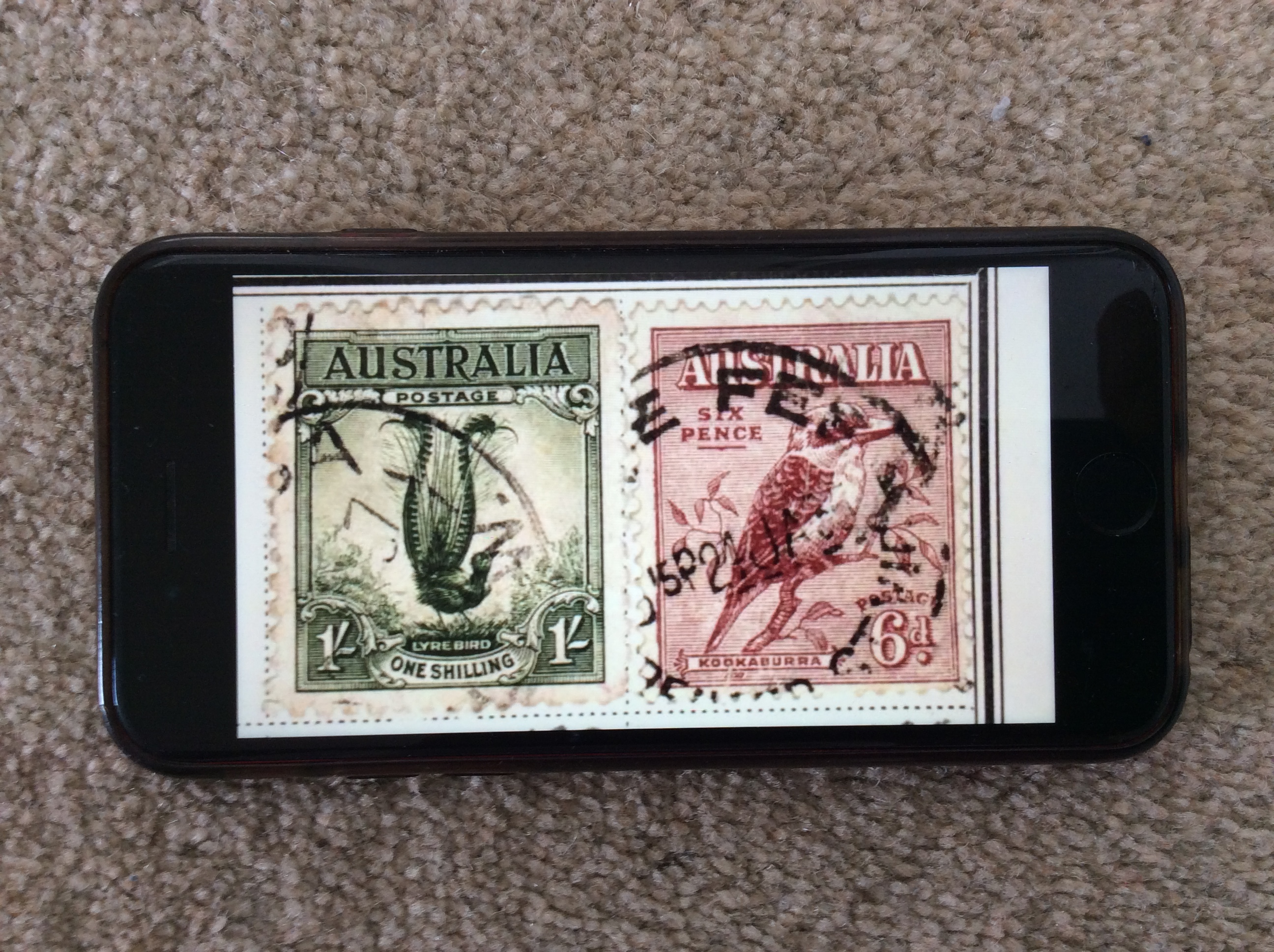
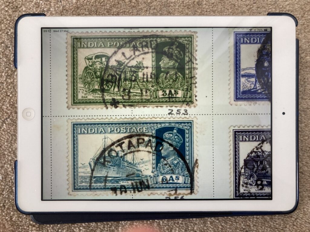
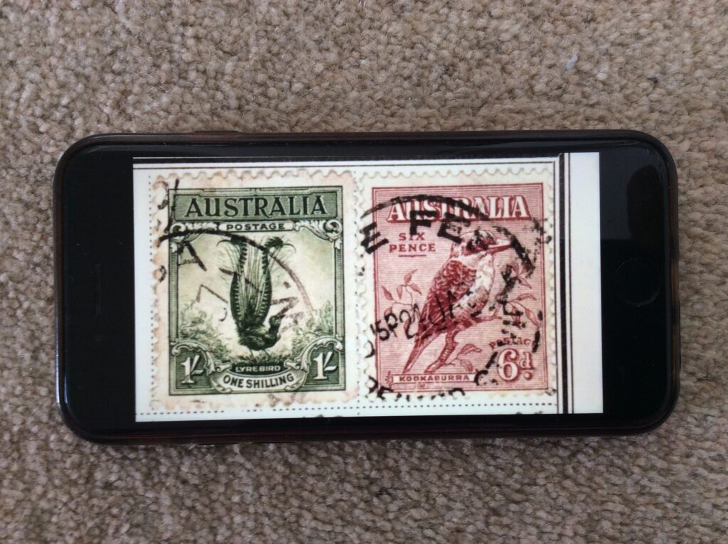
I also have a PDF version on my laptop, my tablet, and my phone; and an eBook version if I need it. In addition to their portability, these electronic versions have another advantage – the images of the fronts of individual stamps can be significantly enlarged should there be a desire to inspect them more closely.

Oh, and, by the way, I did succeed in using Word’s BOOK FOLD function to print out two folios of catalogue pages which I stitched together and fixed into the back of the other countries album as shown below.

A summary idea

In dealing with some of last year’s Xmas cards, one from an old friend made me think again how powerful summaries are. The card has a tree on the front with names of sons, daughters and grandchildren round the edges. On the back is a photo of the grandchildren; and a link to an ‘Xmas newsletter’ is on a sticker inside. It has all the hallmarks of a good summary: easy and quick to access, informative but not providing too much potentially unwanted info, and providing clear directions on how to get to more detail. I tried this out on a report back in 1985 and think it worked reasonably well – but haven’t done it since and haven’t seen anything else like it; but my friend’s Xmas card has all the hallmarks. In these days of information proliferation such approaches ought to be researched, taught and practised widely. Some people may think that AI will be able to do this for us; but, be clear, we’re not talking about a simple ChatGPT textual summary – this involves graphics as well as careful selection of content. The question is not whether AI will be able to do this; its whether the result will be any good or not. For the immediate future we would be better advised to focus on educating people in the art of summarisation.

Springing into action

Yesterday Peter Tolmie and I reached a significant milestone in our work on a book about collecting in the IT era: we signed a contract with the publisher Springer. It commits us to deliver the completed text to their editors by the end of June 2024. We would expect to have a firm publication date by the end of that year. So now, it’s a matter of feeding in some additional material, refining our arguments, and modifying the layout and text to match the Springer Style Guide.

Choosing Rationales

Having explored the conversion of physical DVDs, engineered the delivery of the resulting files to the  lounge TV, and experienced a few of the titles on its delicious 65-inch OLED screen, I set about deciding which DVDs I was going to hang onto. I ended up choosing to keep 20 of the 58 titles with the files totalling around 40 Gigabytes. One of my concerns when I started this journey was that the files produced would be too big to handle and, overall, would take up too much space. However, after adding this extra 40 Gb I still have 135 Gb of free space on my laptop which I consider to be sufficient for at least a few more years. The files themselves range in size from 670 Mb to 3.3 Gb – which is certainly very big; but at least there are only a few of them. In any case (I say to reassure myself) size is a short-term problem, as storage capacities continue to increase.

My rationale for keeping particular titles seem to fall into one or more of the following 5 categories:

  • Watchability – productions that I can enjoy watching over and over again.
  • Sentiment – productions that remind me of good times in the past or that I have a personal connection with.
  • Spectacle – productions that are just awesome to watch with their extraordinary images and ambitious content.
  • Instructive – productions that provide interesting and intriguing information.
  • Music – productions that contain memorable songs or other excellent music.

This collection of files on my laptop would now appear to be a collection of my most favoured moving image productions; but, of course, it is not. They just happen to be the productions I particularly like in a set of DVDs that we just happen to have. A true collection of my favourite titles would entail trying to remember which items I have seen over the last seventy years that I liked best – an extremely challenging exercise. Finding and acquiring those items would probably be equally as challenging; nevertheless, it would probably be an enjoyable and rewarding hobby. However, I’ve never heard of anyone doing it in such a thorough way; only people who have collections of videotapes of a favourite TV series; or of DVDs. The reason is that moving image titles are dependent on modern technology – technology that is either transient like TV, or changing like cine/videotape/DVD. Books don’t have that problem: when people get a physical book, they can just keep it if they like it and they build up their collection of favourite titles over the years. Interestingly, the same has been true for physical DVDs. However, now that moving image has become a standardised software object, it’s possible that more people will gradually build up their collections of digital video files over the years. However, a physical book/DVD has a tangible presence in the world, whereas a software file is just about invisible. Furthermore, we now consume far more moving image material on a daily basis than we do physical books. These two distinctions means that our collecting habits associated with physical and digital media will never be the same.

Following this line of reasoning, I think it unlikely that I will start to add extra items in the future to my new collection of moving image productions. I might include the odd item in the Videos folder if it comes along in the right format and I particularly like it; but I won’t be making special efforts to capture material I enjoy on a regular basis. The collection will stay pretty static over the coming years, and may or may not get dipped into occasionally. As for the physical DVDs from which I have created the software files, I will keep those packaged away in a box in the loft. Not because I will ever play them again, but because I want to have some proof that I did actually purchase the DVDs which I ripped to produce the files: it is certainly illegal to make a copy of a DVD you don’t own.

What makes a DVD worth keeping?

I started assessing each of my DVDs several weeks ago and found myself splitting them into three groups: definitely keep, definitely dispose, and need to watch to decide.  I’ll provide a summary of my conclusions and associated rationales, in a later post. First, however, I want to go into some detail about two DVDs in that final, ‘need to watch to decide’, category because I think they highlight many of the key points about keeping DVDS. They are the two sets of DVDS of the London 2012 Olympic and Paralympic Games. The Olympic games set consists of 5 DVDs (approx. 15 hours running time) produced by the BBC; and the Paralympic set has three DVDs (approx. 7 hours) produced by Channel Four. I had Blu-Ray versions of both which my DVD player will not play. So, I bought ordinary DVD sets in eBay. This is a salient point about DVDS: they were very cheap – just £3.18 and £1.99 respectively inclusive of postage.

To provide the context for my subsequent remarks, you should be aware I’ve been a big athletics fan all my life. I did athletics at school, culminating in doing a decathlon at university. I also used to live next to Stoke Mandeville Hospital where the paralympics movement was born, and I took my young children out onto its track quite regularly. So, having the Olympics come to the UK in 2012, was a dream come true. I attended the Torch procession as it made its way through Aylesbury; and I got tickets to the Rowing, Boxing, Table Tennis, and the evening in the Athletics stadium when Rudisha broke the world 800m record and Bolt won the 200m. For the rest of the time, I watched the television coverage. It was all high octave and memorable. I specifically asked for the DVDs as birthday or Christmas presents because I knew I’d want to watch it all again. But I never did. They just sat on the shelf and my memories remained fond but grew dimmer. Until, that is, It came to this point at which I have to decide if it’s going to be worth keeping at least 8 very large files.

The first thing to say is that the Handbrake conversion was trouble free and produced results which had nothing to indicate they weren’t being played directly from the original DVDs. Secondly, streaming it over the home WiFi into the TV in the lounge from my laptop upstairs in my study also worked without a hitch: I just had to make sure that the power saving settings on my laptop were switched off to prevent the machine closing down during the running of the DVD. Thirdly – and this is a significant point – I found that being able to watch a spectacle like the Olympics on our large 65-inch LG OLED screen is an order of magnitude better than watching on a smaller screen. The screen size and clarity doesn’t just enhance the experience; it turns it into something much closer to a lived experience.

Now, let’s talk about the contents: the sport, of course, is the focal point of the Olympics and Paralympics, and it is undoubtedly very good to watch again – especially as only the highlights of the many days of competition are included. However, the sport is sandwiched between Opening and Closing ceremonies for both Olympics and Paralympics, and these were extraordinarily good. I had forgotten just how good. The themes, the costumes, the lighting shows across the seating areas, the ability to bring on innumerable well-known musicians and other celebrated people (including Stephen Hawking and Tim Berners-Lee), the innovative and daring expositions of our culture – well, it was all breathtaking. The Olympics Opening ceremony actually had a cricket match being played adjacent to a field with sheep in, and another field with wheat in which was being hand-cut – really; and shortly afterwards all that had been replaced with large factory chimneys. And so it went on, the standard being maintained across all four openings/closings. The scale of the productions and the coordination required across hundreds of performers and many different elements (including lighting, performers on wire suspensions, sound, and stage prop movement) was hugely demanding and yet seemed to be carried out flawlessly (though there must, surely, have been some hiccups?). The amount of design work that had been undertaken to underpin the final results was illustrated in one short extra file explaining the thinking behind the ‘House’ scene in the Olympics Opening ceremony in which the last 50 years culture of a typical family is represented over 10 minutes with laser projections onto the house.

With the big screen exploding with activity and colour and the sound turned up to reproduce the roars of the crowd, I became immersed in these 22 hours of extraordinary entertainment. I had forgotten most of the detail of the opening and closing ceremonies so I was reliving and enjoying the experiences again as though they were new. Having watched the Paralympics Closing Ceremony yesterday afternoon, I feel as though I’ve just attended the whole 2012 Olympics/Paralympics again; and what a time it was. It demonstrated the huge depths of creative talent the UK has across many different disciplines; it recounted our history and our culture – an open, caring, supportive, and inclusive culture; and the thousands of volunteer helpers did a magnificent job looking after the visitors to the games. It was a massive, triumphant, success; a platform for the nation to move forwards still further in creating a happy and prosperous society. Such a shame that it was all thrown away in the ensuing ten years. However, that’s by-the-by. The point is that I feel I’ve relived the whole extraordinary experience; and perhaps that’s what we want out of a DVD that we might want to watch again. We want to take what we considered to have been an extraordinary experience, and to be able to relive it and to recapture those feelings again.

The Physical Display Case

Over the last 24 hours I’ve been curating an exhibition of vintage computer artefacts. Well, not really. In fact, I’ve just been repopulating the display case that I emptied when I moved it. But I have tried to apply a bit of rationale to my selections to try and get a bit of an understanding of the issues that real curators face. As is evident from the images below, this has resulted in a significantly different display from that which was in place previously.


I deliberately chose to make the new display a lot less cluttered to enable viewers to settle their eyes on just a few specific items. However, this inevitably led to what is, I guess, one of the main challenges that curators have – having to make difficult choices not just about what to include but also about what to leave out. Following on from the selection activity, I encountered a variety of other curation issues including:

  • Having to go to and from the storage area (in my case, the loft) to collect different items is a time-consuming and irritating process (my selection decisions were taken on a shelf by shelf basis).
  • Having limited shelf space means that some topics, or groups of artefacts, that would be desirable to include, simply can’t be accommodated.
  • Sometimes a choice has to be made to either put like objects together regardless of the date they were made; or to keep items from the same rough date of manufacture, together.
  • Stands or other mechanisms are required to enable objects to be displayed upright instead of lying flat on a shelf.
  • Items at the front of shelves can obscure items at the back of shelves.
  • Shelves closer to the floor are more difficult for the viewer to see to the back of, or to inspect closely.

As for providing descriptions – well that’s another level of complication I haven’t ventured into. I imagine it would significantly reduce the space available for artefacts; and decisions would have to be made about how much information to provide. My let-out for not providing descriptions is that some further information and extra images are available in the digital display on the iPad.

The job of a curator clearly requires a wealth of knowledge, skill, and experience. Right now, I’m on the very lowest rungs of that ladder.


The Digital Display Case

While I was cataloguing and marking the items in the display case collection, I took the opportunity to photograph each one. Not just a single photo; multiple digital images taken from different angles so that viewers could get a feel for all aspects of the object.

Of course, proper 3D images would have been preferable – but I don’t have the equipment or the focus at present: I want to get on with this journey and get the newly moved display case back in action.

The destination for this digital version of the collection is the iPad app, SideBooks, which I have used to display objects emanating from many of the different OFC journeys, and which makes it easy to import files by providing a specific option to download from DropBox (a Dropbox account is easily set up and free to operate at a small scale). Uploading and downloading to and from Dropbox is very quick through a modern broadband connection. SideBooks displays the first page of multiple PDF files in a bookshelf format (with a selection of themes) which can be expanded or reduced to show more or fewer items accordingly, as illustrated below by a view of the complete display case collection next to a much-enlarged version.


In this digital version of the collection, each item is represented only by a single file regardless of how many individual elements it comprises. For example, the Sinclair Cambridge Calculator is accompanied by a plastic case, an instruction booklet and the cardboard box it was packaged in. Multiple images of each of these four items are all contained in a single PDF file, even though they are each individually catalogued and indexed. This is achieved by assigning an overall reference number to the set of related objects (X-002) and by assigning sub-reference number to each object: X-002-01 for the calculator, X-002-2 for the plastic case, X-002-3 for the instruction booklet, and X-002-4 for the cardboard box. Each of these individual items has its own PDF file containing the relevant set of photos, and these are the master digital files associated with the index items. However, for the purpose of the digital display in SideBooks, all the images contained in each of the four PDFs are collected together in a single PDF file titled “X-002 – Sinclair Cambridge Calculator which I gave to my father, Fred, for his birthday in 1977.pdf” as shown below.

In cases in which an object has no associated elements, there is no need to use sub-reference numbers, and the same PDF file can be used as the master digital file and the file for display in SideBooks, for example “X-019 – Blackberry Bold 9700 similar to the one I started to use in CSC in 2009”.

This approach to indexing has been specifically designed to accommodate the capabilities of the digital display application that I am using – SideBooks. If some other mechanism is used, an alternative design may be appropriate. SideBooks enables individual items to be selected and then for each page of the PDF file to be leafed through. Consequently, each photo has been given a separate page in the PDF file. Some brief information about the contents of each PDF is provided at the base of each of the first photo in each file. A more thorough approach might label every photo in every file, but I didn’t think there would be sufficient benefit to make it worth the effort. A more worthwhile exercise would be to provide a short narrative for each object, telling the story about what it is and how it came to be in the collection. This could be provided on the second page of each PDF; and perhaps also delivered as a spoken word sound file which could be selected and played. Such a sound file might also be used to augment the physical display if viewers were able to verbally request that it be played – “Alexa, play X-019”.

It’s worth noting that the physical display case used to present objects in this collection is too small to accommodate all the items at once; whereas the digital display mechanism can display all the items. This is the obvious but significant difference between physical and digital displays of larger collections: all items in a collection can be made accessible digitally, but may be too great in number to be presented physically to the viewer. Having said that, ordering the presentation of items in a digital display may require further effort. SideBooks presents files in the alphabetical order of their file names, which, in this collection, always start with the Reference Number. However, the allocation of Reference Numbers is random; the next item gets the next available Reference Number. Consequently, the items of this collection were somewhat mixed up when the files were presented in SideBooks, whereas I wanted to have all the computer-related items together followed by all the personal items, and ending with the items associated with our visits to four special restaurants. To achieve this ordering, I added a further set of numbers to the beginning of the filenames in Sidebooks, for example, “X-019 – Blackberry Bold 9700 similar to the one I started to use in CSC in 2009” became “SB42: X-019 – Blackberry Bold 9700 similar to the one I started to use in CSC in 2009”. The need to add such numbers is a little irritating, but necessary with this particular digital configuration. SideBooks does allow searching of the filenames – but this can only be done across all the different collections in SideBooks, which, in this case includes many hundreds of mementos, books and papers; and I don’t believe it alleviates the need to deliberately order the digital presentation of the objects.

The ability to have the whole collection on hand in the highly portable iPad is a great advantage – especially when it comes to wanting to take a look at items that haven’t been viewed for many months or years. The sheer accessibility of this combination of slim and lightweight tablet and highly visible software interface, provides a very useful and useable way of keeping a handle on what is in a collection.

Storage Strategies

I had previously kept the packaging for my display case items in a squarish cardboard box measuring 44x44x37 cm. As I emptied the display case and catalogued the items in it, I continued to use the box, piling the items on top of one another, and then removing them to investigate marking mechanisms and to come up with photos used in the previous post. The more I removed, replaced, and searched for items, the more I realised that this storage box was not effective. Smaller items would have to be gathered together into single containers; groups of containers would have to be stored in drawers; and items and containers would have to be placed in numerical sequence. With these principles in mind, I set about amalgamating groups of items into single boxes. The result is shown in the before and after images below.


I then set about trying to find some cheap stacks of plastic drawers, but couldn’t find any with suitable dimensions (they would have to accommodate the largest item – the packaging for a ZX 82 computer, measuring some 36x21x10 cm: the brown box in the second line of objects in the photos above). However, when I was in IKEA buying a new bookcase, I did find something that I thought might be big enough, for just under £30. I took a chance and bought it, but, as can be seen in the image below, it was too small and couldn’t accommodate the items sitting on the top. The answer was to stand a plastic storage box on the top. Labels for each drawer were secured in tightly behind the corner strut of each drawer; and, for the transparent box, was lodged inside against the outward facing side wall.


My plan was to locate this storage facility in my loft, and on this occasion, I got lucky; the gap between the loft rafters is some 1.5 cm wider than the rack of drawers so it fits between them perfectly.


Having got all the items stored away, in order and easily accessible, I am now able, at my leisure, to select which one’s I want to put in the display case at any one time.

Marking and Labelling experiences

The Collection Trust booklet provides very specific guidance on marking items. It advises that items are labelled and marked in ways which are:

  • Secure – The chances of accidental removal of the label or mark from the object
  • must be extremely low.
  • Reversible – It should be possible for a label or mark to be removed intentionally
  • from an object, even after 50-100 years with as little trace as possible.
  • Safe for the object – Neither the materials applied to the object nor the method by
  • which they are applied should risk significant damage to the object.
  • Discreet but visible – The recommended methods should not spoil the appearance
  • of the object, nor obscure important detail. However, the number should be visible
  • enough to reduce the need to handle the object.

For the positioning of labels and marks it suggests that you should:

  • Avoid physically unstable surfaces. Also avoid placing labels or marks across a line
  • of weakness or fracture.
  • Choose a position so that the number is unlikely to be visible when the object is on
  • display but is accessible in store.
  • Avoid decoration and painted/varnished/pigmented/waxed areas.
  • Avoid surfaces where the mark is likely to be at risk from abrasion, such as surfaces
  • on which it normally rests, or where touched during handling.
  • Locate the number so that the handling necessary to read it is minimised (consider
  • marking the packaging or adding an extra tie-on label as well).
  • With composite objects, mark the part on which the most secure method can be
  • Where duplicate marks are made these should be in different positions on the object
  • (bearing in mind, of course, the other principles listed above).

And for writing on objects, it recommends the following:

  • Apply B72 20%-in-acetone as a base barrier coat on the object.
  • Write the Ref. No. with a permanent black or white marker.
  • Apply B67 20%-in-white spirit as a top coat.

Should a mistake be made, this combination can be easily removed with acetone.

I duly searched the internet and found several suppliers of these items. In the end I bought small bottles of 20% B72 and 20% B67, a bottle of acetone, and a fine marker pen for about £20 from ZOIC PalaeoTech Limited.

After a couple of tests applying base coat, pen, and top coat, I set about removing the items from the cabinet, matching them up with any packaging etc. that had been stored separately, and creating relevant index entries.

Guidance on drying times for base coat, pen, and top coat, ranges from a few minutes to 24 hours. I chose to try to space out each part of the process by at least a few hours, and then it soon became apparent that I needed some systematic way of knowing which items were at which stage of the process. My answer was to have separate adjacent areas on my desk for each stage, so that the objects would progress from right to left.

Use of the B72 and B67 solutions wasn’t difficult; the brush applicators built into the bottle tops make it easy to apply a line in a single stroke. However, my nose certainly did pick up the strong odours emanating from the bottles; advice on open windows and, possibly, wearing a mask is worth taking note of.

Decisions on whether to use either a black marker or a white marker were easily made based on which one would stand out best on the relevant background. However, marker pens were certainly not the only way I labelled items. My preferred option was to used stringed labels whenever I found a way of attaching them: of the 223 separate objects dealt with in this exercise, stringed labels were applied to 134 of them, while Ref. Nos. were painted onto only 51.  The table below summarises all the different labelling techniques I used across the collection.

Did I follow the advice in the Collection Trust booklet? Well, broadly speaking, yes when painting-on the Ref. Nos. or using stringed labels. However, for the 12% of items on which I pencilled-on the Ref. Nos. I suspect I wasn’t following best practice; and, as for the use of Post-IT notes, well I know myself that they come away very easily. In my defence, all of the Post-IT items had been previously labelled in that way and I saw no better way of labelling them. The final category in the table above – ‘No Ref. No. applied’, is of course completely contradictory to the guidance. However, there were good reasons for not labelling each of them: one is a SIM card that is just too small to write on and, in any case, is unlikely to be lost as it is located inside an iPhone; another is the commemorative coin shown in the table above, for which a painted-on Ref. No. would certainly detract from its quality. A similar rationale applies to the tooth shown in the table – it is too small and irregular to have a Ref. No. painted-on, and even the string of a label wrapped around it would obstruct its inspection. The  final items are three pieces of terracotta pottery which, according to the marketing letter accompanying them, are supposed to have just been found in the desert sands – a claim which would not stand up if a Ref No. appeared on them in any shape or form.

Regarding my use of stringed labels, I found a variety of different ways of attaching them, as illustrated in the table below.

Although I felt my use of stringed labels was quite successful, I did realise half way through the exercise that the cotton thread I was using when I needed longer string lengths, was not strong enough and might easily break if caught or pulled; and in any case might deteriorate over time. This prompted me to look for archival quality thread and stringed labels, and I duly acquired them for about £15 including postage from Preservation Equipment Ltd as shown below. I shall use them to swap out the labels I have already applied, at some time in the future.

Indexing Arrangements

If I was to catalogue all the items as I removed them from the Display Case, I needed a clear indexing regime. There seemed to be two options; either to create a separate index, or to include the items in one of my existing indexes. I have some experience to draw on in making this choice. In my earlier work on Mementos, I’ve set up an index for my own personal items (with a Ref. No. prefix of PAW), and another index for items special to both myself and my wife (with a different Ref. No. prefix). For the most part, this separation has worked fine, but occassionally I’ve forgotten which set an item might be in, and I’ve found myself having to check both indexes. In fact, I’ve concluded that it will be better to merge them at some point in the future, especially as both indexes have the same fields, and the different Ref. No. prefixes will ensure uniqueness.

In fact, this assembly of different sets of material in the same index has already been shown to work in my PAWDOC work filing system. This includes many different types of items ranging from documents to ring binders and 35mm slides. All have different Ref. No. prefixes which not only ensure uniqueness in the numbering system, but also enables different sets to be stored in different places. The PAWDOC filing system has been stress-tested for over 40 years and has demonstrated that this approach does work in practice.

Taking all this into account, I decided I would simply add these display case items to my personal PAW mementos index; and that I would employ the prefix ‘X’ in front of the reference number. I chose X because I wanted to make the Ref. No as short as possible, as easy to write as possible, and as clearly distinguishable as possible, because I anticipated having to mark some of the display case items in small font with a marker pen.

I’ve always found marking items to be a bit of challenge. For many of the items in my document collection (for which there was no need to retain the integrity of the items), I was able to just write the Ref. No. onto the top left of the document. However, sometimes there wouldn’t be enough empty space to write in the Ref. No., or the material wouldn’t absorb the felt tip pen ink. In these cases, I wrote the Ref.No. on a rectangular piece of paper with adhesive backing and then stuck it onto the item. For the items in my loft storage experiment I’ve used stringed labels, though sometimes it’s been difficult to find a way to attach them: and for the memento collections already mentioned, I’ve been using cut pieces of Post-IT notes which have an adhesive backing which peels off very easily. This last solution ensures that the items concerned are not defaced – but I find that many of the labels simply come off in the course of handling the items, turning pages, or with the passage of time.

For this exercise, therefore, I decided I would try and do it properly and find out what the professionals do. On trawling the net, I quickly found a very useful Labelling and Marking Booklet produced by The Collections Trust with the help of Vivien Chapman at the National Conservation Centre, National Museums Liverpool (NML). This advises that not only should you give a unique number to each accessioned object and securely label or mark it with this number; but also that all detachable parts of an object should be marked using suffixes to the Object number. The latter part  of this advice was of particular significance because some of the computer objects in the display case have accessories, documentation, and  boxes with removable inserts.

Having taken this advice on board, and sticking to the principle of keeping the Ref. No as short as possible, I decided on the following reference number scheme:

  • Use the prefix ‘X’ followed by a hyphen followed by a three-digit number starting with 001 where, for numbers less than 100, there are two leading zeros;
  • For single items with no detachable parts, use the next available number, for example, X-015;
  • For items with detachable parts, add another hyphen and follow it with a serial number with no leading zeros, for example, X-056-1, X-056-2, X-056-3. Note that, in this case, there would be no X-056: the main object would have the first of those numbers – X-056-1.

In addition to the Ref.No., the existing index I intend to use contains the following fields: Description, Facet 1, Facet 2, Publication Date, Earliest Year, Physical Location, Digitisation Method, Electronic Format, # of Digital Files, Creation Date, Notes. The Description field can contain any text unconstrained by length. This is how I shall be indexing the items in the display case and all their accompanying accessories and boxes.